After 35 years in the industrial door and security sector, Arkas had earned its stripes, but its brand hadn’t aged as well as its engineering. The brief? Modernise everything: brand, digital presence, tone, without alienating the legacy clients who built their business.
They needed to look like leaders, not leftovers.
The Strategy
We approached Arkas the way they approach their installs, zero compromise.
Brand Evolution, Not Revolution
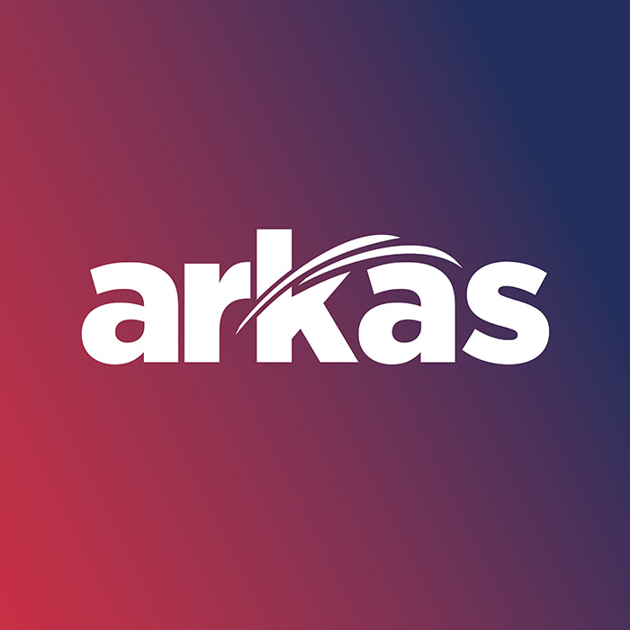
The old Arkas logo (see image) had legacy weight. We re-engineered it with sharper typography and a bold, minimal graphic accent, a nod to motion, protection and precision.
Visual Identity System
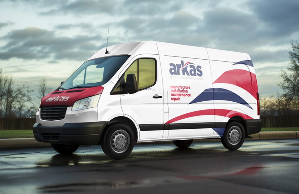
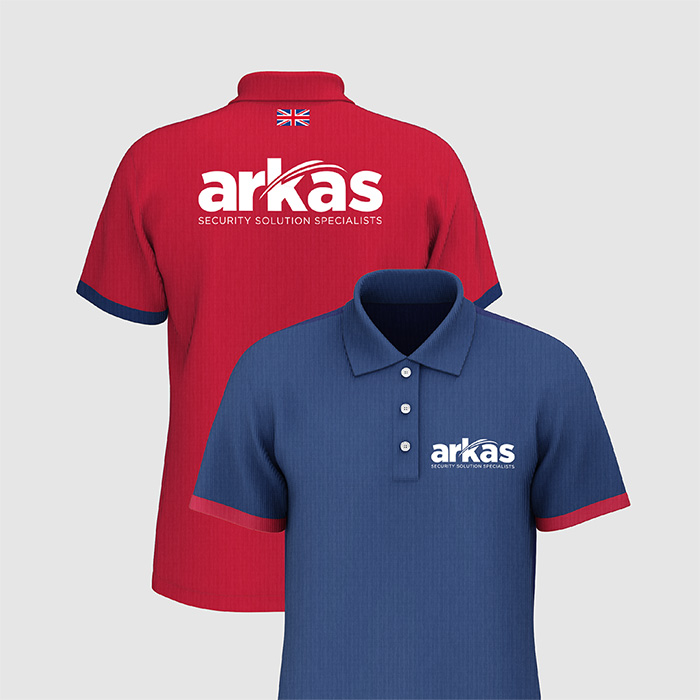
A toughened-up palette, custom type adjustments, and versatile logo locks gave Arkas a toolkit that works across vans, hard hats, laptops, and LinkedIn banners.
Website Overhaul
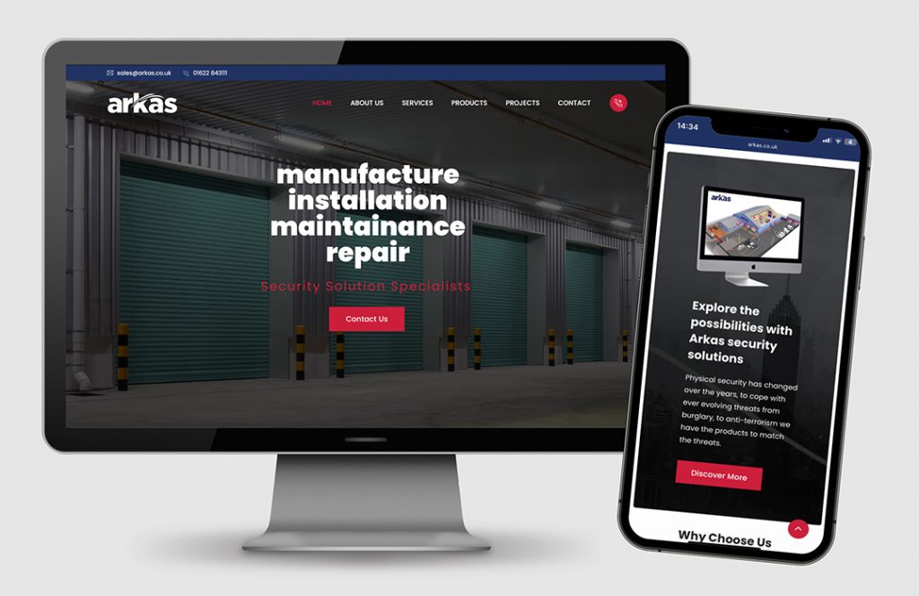
We rebuilt the site to feel fast, structured, and clear. The design balances technical trust with human usability, giving buyers what they need in three clicks or less.
Execution Highlights
Iconic brand refresh that respects the past but commands modern credibility.
Mobile-optimised, conversion-focused website with simplified service nav.
Visual branding built for both construction grit and boardroom polish.
The Impact
The new Arkas brand rolled out as part of their 35-year milestone, but the results feel more like a launch than a legacy. The company now presents as the category leader it truly is, ready to secure the next 35 years.
Why It Worked
We didn’t just make it look better. We made it feel like Arkas, only evolved, upgraded, and battle-ready for a digital-first future.